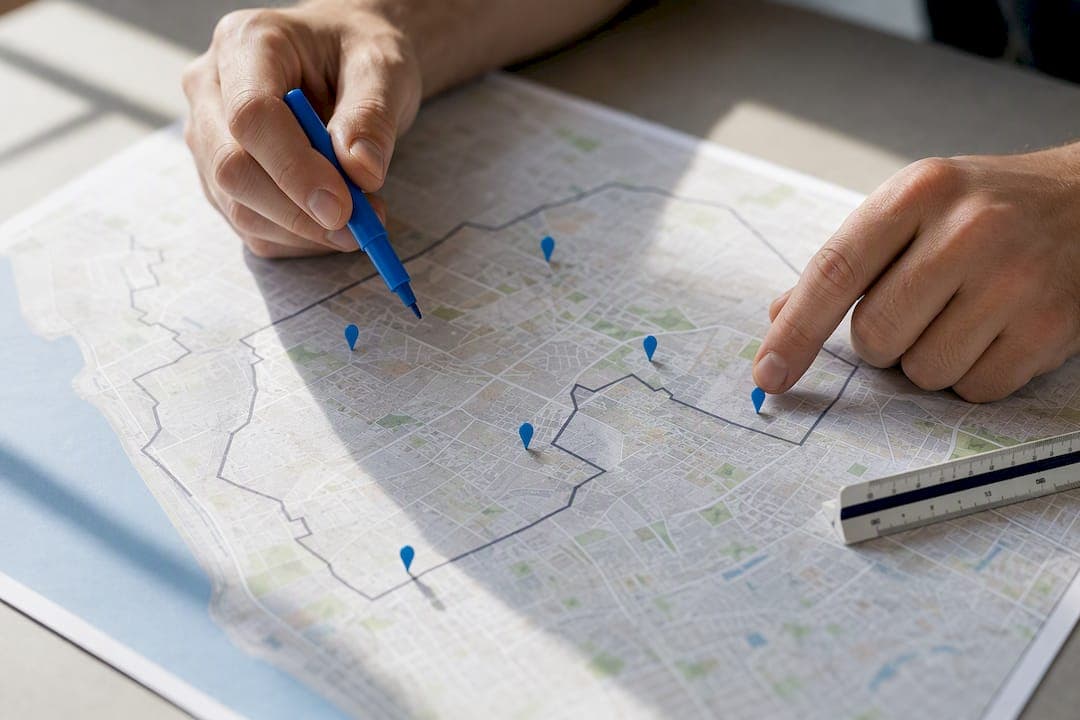
Service area mapping is the process of defining and visualising the geographic zone a business can realistically serve, then turning that zone into a boundary customers and dispatchers can trust. For most operational promises, drive-time (isochrone) mapping beats a simple radius, because it reflects the actual road network rather than a straight-line guess. Reserve radius circles for rough estimates only, and move to network-based analysis once response times or arrival windows matter.
TL;DR:
- Using drive time for mapping ensures more accurate service boundaries than simple radius estimates, especially in areas with complex road networks.
- Validating boundary accuracy with real addresses and route checks is crucial to prevent overpromising and customer disputes.
- Small teams benefit from simple, validated maps and straightforward update routines rather than complex, untested service area models.
- Combining internal detailed maps with simplified public versions helps avoid conflicts and supports better operational control.
- Automated booking tools that incorporate mapped boundaries improve enforcement and reduce manual checking, streamlining small business workflows.
Table of Contents
- What is service area mapping, exactly?
- Radius, drive time, or postcode: which method fits your business?
- Tools for mapping service areas: from quick drawing to full GIS
- How do you actually build a defensible service area map?
- Testing your boundaries: validation and export formats
- Getting maps into your booking and dispatch workflow
- What MyAirCare's operational experience says about mapping small teams
- Why most service area maps fail before they're even published
- A booking platform that respects the boundaries you've mapped
- Sources
- FAQ
What is service area mapping, exactly?
Service area mapping is the practice of defining the geographic zone a business can serve and showing that zone as a boundary on a map. In GIS terms, a proper service area is a network-based polygon: the streets reachable from a facility within a given travel time, distance, or other constraint. That is different from a radius, which just draws a circle around a point and ignores roads entirely.
A few terms come up constantly once you start building these maps:
- Facility — the origin point (your depot, warehouse, or technician's start location) from which reachability is measured.
- Cutoffs (or breaks) — the time or distance limits that define each boundary, such as 15, 30, and 45 minutes.
- Travel mode — driving, walking, or cycling, since each uses a different road or path network.
- Travel direction — whether you're measuring time to the facility or from it, which matters for services with fixed depots.
- Impedance — the cost variable driving the calculation, usually time or distance.
Roads, turn restrictions, one-way streets, and traffic all change these results. Esri's own documentation treats a service area as a network reachability polygon precisely because a straight-line radius can put a customer 8 kilometres away but 40 minutes by road inside your circle, while missing someone 5 kilometres away who's genuinely 12 minutes out. That gap is the whole reason network-based mapping exists.
Radius, drive time, or postcode: which method fits your business?
The method you choose should match the decision you're making with the map, not just what's easiest to draw. A radius is fast to set up but blind to roads. Drive time and drive distance reflect reality but need more setup. Postcodes and local government areas suit reporting, not real-time dispatch decisions. Hand-drawn polygons suit contractual or franchise boundaries that don't follow any natural shape.
Here's how the main methods stack up against each other, according to MapBusinessOnline's guidance on service area creation:
- Radius — quick and simple, good for a rough marketing estimate, but ignores rivers, highways, and dead ends.
- Drive time — the most defensible option for dispatch and arrival promises, since it's built on the actual road network.
- Drive distance — useful when fuel cost or mileage caps matter more than time.
- Postcodes/LGAs — convenient for reporting and sales territory splits, but the boundaries are statistical approximations, not property lines.
- Hand-drawn polygons — necessary for irregular or contractual boundaries a formula can't replicate.
Multiple concentric cutoffs (say, 15, 30, and 45 minutes from the same facility) let you colour-code service tiers on one map: green for standard response, amber for a surcharge zone, red for occasional or by-request coverage.
Pro Tip: Start with a single drive-time boundary before layering tiers. Adding three colour bands to a map nobody has validated just multiplies the places where the boundary might be wrong.

Tools for mapping service areas: from quick drawing to full GIS
The right tool depends on how much control you need and whether a developer is involved. Broadly, there are three tiers: consumer map makers for quick jobs, developer APIs for custom builds, and full GIS platforms for advanced network analysis.

Consumer and small-business tools suit teams that need a coverage map fast, without writing code. Platforms such as ScribbleMaps, RadiusMapper, and Atlist let you draw polygons by hand, switch between radius and postcode modes, and export or embed the result on a website in minutes. These tools trade precision for speed. They're strong for a public-facing "do we service your suburb" page, weaker for dispatch decisions where a few minutes of drive time changes who gets the job.
Developer APIs give you programmatic control over isochrones. Google's Isochrones API generates travel-time polygons rather than straight-line radii, with settings for travel mode, edge smoothing, and travel direction. Worth knowing: driving isochrones through this kind of API typically cap out near 60 minutes, which matters if your service radius genuinely extends further than that. This route suits businesses building the map into their own booking system or website, but it needs a developer to wire up.
GIS platforms like Esri's ArcGIS handle the advanced end: per-facility cutoffs, time-of-day and day-of-week modelling, and the choice between polygon outputs and line-based (road-only) outputs. ArcGIS Pro's service area analysis documentation shows how direction-aware settings change results for time-sensitive jobs, since morning traffic patterns can shrink a service area compared with the same trip at 2pm.
Cost and complexity rise in that order. Consumer tools are often free or low-cost with no technical skill required; APIs bring usage-based pricing and developer time; full GIS platforms bring licence costs and a genuine learning curve. Match the tool to the decision the map is meant to support, not to whichever one looks the most sophisticated.
How do you actually build a defensible service area map?
Building a map that survives contact with real customers and real roads takes more than drawing a shape and publishing it. Esri's own workflow for network-based service area analysis breaks down into steps that apply whether you're using a full GIS platform or a simpler tool.
- Set your goal and define facilities. Decide whether the map serves dispatch, marketing, or pricing, then mark the exact origin point (depot, warehouse, technician base) for each.
- Choose travel mode, direction, and cutoffs. Pick driving, walking, or cycling; decide if you're measuring time to or from the facility; set your breaks (15, 30, 45 minutes, for example).
- Use concentric breaks for service tiers. Layering cutoffs from the same facility lets you show standard coverage, extended coverage, and by-request zones on one map.
- Generate the areas and inspect for gaps or overlap. Network-based polygons can include unreachable pockets or islands where a river or highway blocks access despite falling inside the drawn boundary.
- Validate with edge-address checks and sample routing. Pick real addresses near each boundary line and confirm the map's promise matches an actual driving route.
- Publish separate public and operations maps. Customers see a simplified, defensible boundary; your team works from a detailed layer with notes and exceptions.
- Document ownership and set an update cadence. Assign someone to own the map and schedule a review, especially after adding a technician, losing a depot, or a major road change.
Pro Tip: Treat step five as non-negotiable. A map that looks right on screen can still promise a 20-minute arrival to a street that's actually a 40-minute detour around a river, and you won't know until a customer complains.
Testing your boundaries: validation and export formats
A service area polygon is a model, not a guarantee. ArcGIS Pro's practitioner notes point out that smoothed polygons can include unreachable islands, and that line-based outputs following actual roads are often a truer picture than the tidy shape most customers see. Test the edges, not just the middle.
A practical edge-address check runs 5 to 10 sample addresses per boundary line: some clearly inside, some clearly outside, and a handful right on the line where disputes actually happen. Run each through real routing (not just visual inspection) and note where the map's promise and the actual drive time disagree.
Once validated, keep two versions:
- Internal layer — full detail, including notes, exceptions, overlapping technician zones, and restricted streets.
- Public map — simplified boundaries only, avoiding the kind of granular detail that invites an argument over a few hundred metres.
For exports, match the format to the job: GeoJSON or KML for feeding other systems and field apps, PNG or PDF for marketing materials and printed quotes, and CSV for recording your edge-address test results so the validation work can be retained when updating the map.
If you're using Australian postcodes or Local Government Areas for any part of this, treat them as reporting tools rather than operational fact. The ABS ASGS boundary layers are statistical approximations, updated annually, and don't always align with legal or practical boundaries on the ground.
Getting maps into your booking and dispatch workflow
A validated map is only useful if it actually changes what happens at booking time. Two rough approaches suit different needs: embed a live, interactive map for customers checking coverage online, or use a static PNG/PDF for marketing material and quotes where interactivity isn't needed.
For internal systems, export the validated boundary as GeoJSON and feed it into field apps or geofencing rules, so a booking outside the service area gets flagged automatically rather than caught after a technician's already been dispatched. A tool built for field service management can consume this kind of file directly, cutting out manual boundary checks.
Whichever route you take, add a visible "last updated" timestamp to any public-facing map and set a fixed review cadence, so customers and staff both know how current the boundary actually is.
What MyAirCare's operational experience says about mapping small teams
Working with local air-con cleaning teams, one pattern shows up constantly: the businesses with the fewest disputes keep their public map simple and their operational map detailed, and never mix the two. Customers need a fast yes or no; a technician needs the notes on why one street in a "covered" suburb is actually a 35-minute detour.
Mapping rules feed directly into pricing, too. Once you know your genuine drive-time tiers, converting the outer band into a travel fee becomes a straightforward calculation rather than a guess. For small teams, the governance overhead doesn't need to be heavy: one owner, a shared document logging exceptions, and a review every time a technician or vehicle changes is usually enough to keep the map honest.
Why most service area maps fail before they're even published
The conventional advice on service area mapping treats it as a one-off design task: pick a tool, draw a boundary, publish it, move on. That's backwards. The research on network-based analysis is consistent on one point: a polygon that hasn't been tested against real addresses is a guess wearing the costume of data. Esri, Google, and the GIS practitioner literature all converge on the same warning, in different words: the map is a model, and models have edges that don't match reality.
What gets underestimated is the value of two maps, not one. A single shared boundary, used for both customer promises and internal dispatch, almost guarantees friction, because the detail a dispatcher needs (exceptions, overlapping zones, one bad street) is exactly the detail that makes a customer-facing map look messy and disputable.
Small teams should prioritise validation over sophistication. A radius map that's been checked against ten real addresses beats an unchecked isochrone with three colour tiers. Get the boundary right before you make it pretty.
— Lewis
A booking platform that respects the boundaries you've mapped
There are other routes to enforcing a service area at booking time: custom geofencing built on a GeoJSON export, or a manual check every time a customer calls. Both work, but both add admin load a small team often can't spare. Some booking platforms put mapped boundaries to work inside the booking flow itself rather than as a separate lookup step.

Such platforms may run branded booking pages, automated job reminders, and secure payments through Stripe, so once coverage tiers are known, they can be built into booking flows rather than requiring manual checking of each job against a map. It suits teams that want mapping rules enforced automatically without hiring a developer to wire up an API. Compare the Free and MyAirCare Pro plans to see which fits your team, or look at how the platform runs end to end on the main MyAirCare site.
Sources
- Service areas — Esri Developer documentation
- Isochrones API overview — Google for Developers
- ASGS2024/LGA (MapServer) — Digital Atlas / ABS
FAQ
What's the difference between a radius and an isochrone?
A radius is a straight-line circle around a point, ignoring roads entirely. An isochrone is a network-based polygon showing everywhere reachable within a set travel time, which usually looks lopsided rather than round because it follows actual roads.
Which tool should a small business start with?
Start with a consumer map maker like ScribbleMaps, RadiusMapper, or Atlist if you just need a public coverage map quickly. Move to a developer API or a GIS platform like Esri's ArcGIS once dispatch accuracy or per-facility analysis matters more than speed.
How often should a service area map be updated?
Review the map whenever you add or lose a technician, a vehicle, or a depot, and set a fixed cadence (quarterly is common) even without changes. An outdated boundary without an assigned owner is one of the fastest ways disputes creep back in.
Can postcodes or LGAs be used as a service area?
Postcodes and Local Government Areas work for reporting and rough territory splits, but the ABS itself notes these boundaries are statistical approximations updated annually, not legal property lines. Use them for internal reporting, not for promising a customer coverage.
Does MyAirCare help enforce service area rules at booking time?
MyAirCare's branded booking pages and job management tools let air-con cleaning businesses apply their own mapped coverage rules and travel fees within the booking flow. Current plan pricing, including the Free and Pro tiers, is listed on the MyAirCare site.